How to Choose the Best Paint Colours for Your Home?
So, you have renovated your house, improved its structural integrity, and upgraded the appliances. But, there’s something missing. Perhaps, that’s the color. No matter how sophisticated or luxurious interior appliances you choose, your house won’t look complete until you pick the right colors.
The biggest struggle for a homeowner is choosing paint colors for their freshly renovated house. To make it easy, we’d advise you to start with the color you love. Make it the base and decide the hues around it. If you are confused about the paint color selection, this post is for you.
Choose a Color Tone
Painting your house is not as simple as picking a few shades and painting your entire interiors and exteriors with them. You need to consider your furniture, decorative items, appliances, and the overall house ambiance to decide on a color tone first.
You can have either cool or warm tones. Neutrals, like white, beige, and gray, also look pretty decent. But their undertone should match your overall color theme. Warm tones, like red and yellow, create a brighter, more energetic, and more positive environment. Cool tones, like blue and purple, are for calmness and relaxation.
Neutrals are the Best
When in doubt, go for neutrals. They are super versatile and can blend in with just about any environment and furnishing flawlessly. Neutral walls combined with pastel ceilings can help you add simple and soothing colors to your space.
Unless you want a bohemian-style and colorful house, it’s best to mix neutral and bright hues to balance the light and dark shades. Whites without undertones are perfect for ceilings. Whites with cool and warm undertones are the best for your rooms.
Choose a Color Scheme From Your Artwork
If you have used artwork as decorative pieces, you can find paint color options for your home from these pieces. If you have a favorite piece, pick a color from that. Make it your base and choose neutral colors with the base color’s undertone for the remaining walls.
This works wonders for your living room or bedroom. The artwork will blend in beautifully with the wall colors. Not just for the bold color, but you can take complementary colors from your artwork, as well.
Stick to the Same Tone
You don’t have to stick to one color for the entire house, but choosing colors with similar tones is a great idea. If you have connecting rooms, you can improve the flow by choosing colors that are a few shades darker or lighter than the color in your other rooms.
This doesn’t mean you have to limit your interiors to the colors of the same family. We’ve all seen homes that have at least one room painted bold and bright, contrasting with the lighter tones of other spaces. However, this works for dining spaces, kitchens, and small areas. Do not use these bold color settings for your rooms, as it will create a color clash, which is not very pleasant to look at.
This is especially important if you have open space. Using different colors for different open areas won’t look good. Besides, they make your space look cramped. Stick to the same hues for open spaces.
Use Bold and Bright Colors Wisely
Sometimes, you may have a bold color palette in mind, but using that throughout your house might not be a viable idea. Let’s say your daughter likes Barbie-like interiors and walls painted bright pink. While that may create a bedroom of her choice, it may not go well with the rest of your interior.
So, the best thing you can do here is use this color on the ceilings instead. This way, people entering your daughter’s room won’t see the pink, and your daughter can have a really nice view when she looks up when resting.
Try Naturals
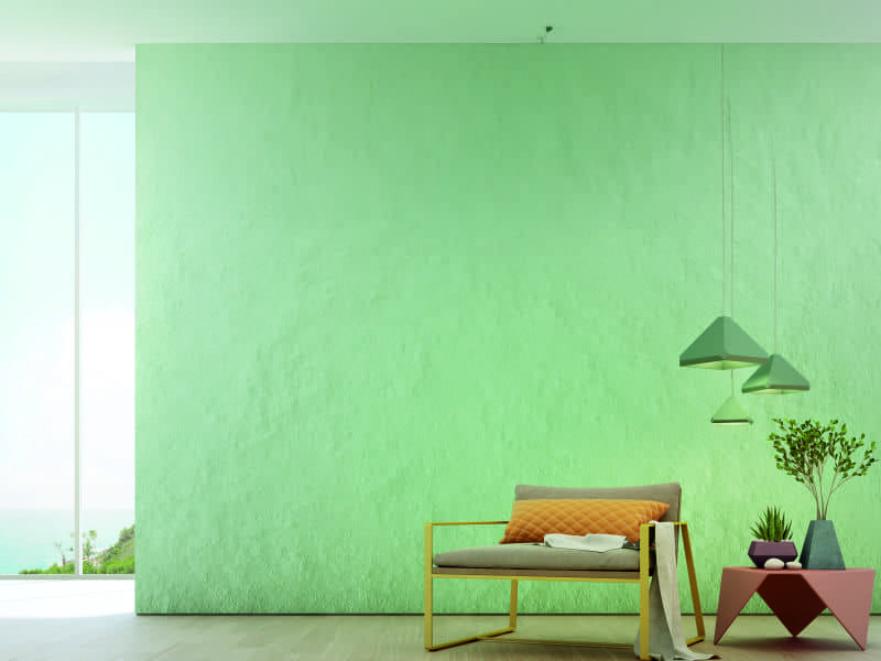
The latest colors in trend are neutral and natural. What could be better than natural colors that complement your exteriors and add freshness to your home? If you want a natural vibe in your space, search for colors with earthy and greenish tones.
Blue, green, taupe and wooden colors are ideal for your interiors. These look wonderful with gray, white, and other neutrals. You can also use pastel colors to give a natural feel to your space.
Monochromatic Hues Look the Best
Earlier we mentioned how you don’t have to limit yourself to one color for the entire house. But, a monochromatic color scheme doesn’t look bad when done well and in the right environment. Using the same color throughout the house will add depth to your interiors while inducing feelings of positivity, warmth, and calmness. You can also use a single color in different ways or with different undertones. This will help you stick to the monochromatic style while adding a little variety to your walls.
Balance the Hues
All walls painted bright might look way too vibrant for your interiors. Likewise, painting your entire house white or beige might look boring. The best color scheme for modern homes is a combination of darker and lighter shades. If you are painting one wall bold, choose lighter tones for the rest three. If the color looks too dark for your room, ask the professional to mix it with a lighter shade.
Paint Your House Beyond Walls
Walls aren’t the only place you can paint. You can play with funky colors in other areas, like your ceilings, doorways, stairs, and the floor. If you have a cute and fun color combination in mind, but that looks too bold for the walls, how about you use them for the ceilings or floors? That way you can add your favorite colors to your house, without compromising on your selected color theme.
Conclusion
Consider paint sample testing before finalizing the colors for your interiors. Paint the colors in a small corner of each room to see how it goes with the overall room setting. Remember, the colors may look different on the catalog and your walls. So, always check them in person.